Use this design system
Tokens · motion · components — drop straight into your project.
Download design kitStart a project with it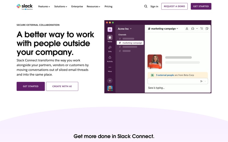
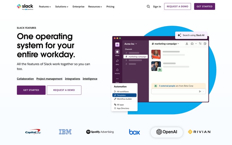
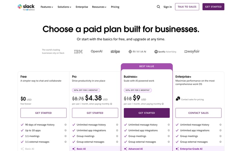
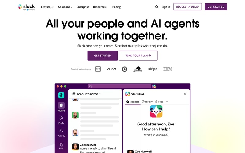
Similar styles
# Slack Design System

## Design Tokens

### Colors

| Token | Hex | Usage |
|-------|-----|-------|
| `--color-aubergine` | #611F69 | Primary brand color, buttons, sidebar backgrounds |
| `--color-black` | #1D1C1D | Headings, primary text |
| `--color-white` | #FFFFFF | Backgrounds, button text |
| `--color-gray-50` | #F8F8F8 | Page backgrounds, subtle fills |
| `--color-gray-200` | #E8E8E8 | Borders, dividers |
| `--color-gray-500` | #616061 | Secondary text, muted elements |
| `--color-blue` | #1264A3 | Links, interactive elements, channel highlights |
| `--color-cyan` | #36C5F0 | Slack logo accent, notifications |
| `--color-green` | #2EB67D | Slack logo accent, success states |
| `--color-red` | #E01E5A | Slack logo accent, alerts |
| `--color-yellow` | #ECB22E | Slack logo accent, warnings |

### Typography

**Font Families:**
- Primary: `Lato, -apple-system, BlinkMacSystemFont, "Segoe UI", sans-serif`
- Monospace: `Monaco, Menlo, Consolas, "Courier New", monospace`

**Type Scale:**

| Token | Size | Line Height | Weight | Usage |
|-------|------|-------------|--------|-------|
| `--text-hero` | 72px | 1.1 | 700 | Hero headlines |
| `--text-h1` | 48px | 1.2 | 700 | Page titles |
| `--text-h2` | 36px | 1.3 | 700 | Section headings |
| `--text-h3` | 24px | 1.4 | 600 | Subsection headings |
| `--text-body-lg` | 18px | 1.5 | 400 | Large body text |
| `--text-body` | 16px | 1.5 | 400 | Default body text |
| `--text-body-sm` | 14px | 1.4 | 400 | Small text, captions |
| `--text-label` | 12px | 1.3 | 600 | Labels, metadata |

### Spacing

| Token | Value | Usage |
|-------|-------|-------|
| `--space-1` | 4px | Tight spacing, icon gaps |
| `--space-2` | 8px | Small gaps |
| `--space-3` | 12px | Medium-small gaps |
| `--space-4` | 16px | Base spacing unit |
| `--space-5` | 20px | Medium gaps |
| `--space-6` | 24px | Medium-large gaps |
| `--space-8` | 32px | Large gaps |
| `--space-10` | 40px | Extra-large gaps |
| `--space-12` | 48px | Section spacing |
| `--space-16` | 64px | Major section spacing |
| `--space-20` | 80px | Hero section spacing |
| `--space-24` | 96px | Page-level spacing |

### Border Radius

| Token | Value | Usage |
|-------|-------|-------|
| `--radius-sm` | 4px | Small elements, badges |
| `--radius-md` | 6px | Buttons, inputs |
| `--radius-lg` | 8px | Cards, panels |
| `--radius-xl` | 12px | Large cards, modals |
| `--radius-full` | 9999px | Circular elements, pills |

### Shadows

| Token | Value | Usage |
|-------|-------|-------|
| `--shadow-sm` | 0 1px 2px rgba(0,0,0,0.05) | Subtle elevation |
| `--shadow-md` | 0 4px 8px rgba(0,0,0,0.08) | Cards, dropdowns |
| `--shadow-lg` | 0 8px 16px rgba(0,0,0,0.12) | Modals, popovers |
| `--shadow-xl` | 0 16px 32px rgba(0,0,0,0.16) | High elevation overlays |

### Borders

| Token | Value | Usage |
|-------|-------|-------|
| `--border-width` | 1px | Default border width |
| `--border-width-2` | 2px | Emphasized borders, focus states |
| `--border-color` | #E8E8E8 | Default border color |
| `--border-color-dark` | #D1D1D1 | Stronger borders |

## Components

### Primary Button
- Background: `--color-aubergine`
- Text: `--color-white`
- Padding: `12px 24px` (small), `14px 32px` (medium), `16px 40px` (large)
- Border radius: `--radius-md`
- Font weight: 600
- Text transform: uppercase (for CTA)
- Hover: Darken 10%
- Active: Darken 15%

### Secondary Button
- Background: transparent
- Text: `--color-aubergine`
- Border: 2px solid `--color-aubergine`
- Padding: `12px 24px`
- Border radius: `--radius-md`
- Font weight: 600
- Hover: Light aubergine background (#F5F1F6)

### Navigation
- Height: 64px
- Background: `--color-white`
- Border bottom: 1px solid `--border-color`
- Logo: 80px width
- Links: 16px, 600 weight, `--color-black`
- Hover: `--color-aubergine`

### Card
- Background: `--color-white`
- Border: 1px solid `--border-color`
- Border radius: `--radius-lg`
- Padding: `--space-8`
- Shadow: `--shadow-md`

### Slack Sidebar (Product UI)
- Background: `--color-aubergine`
- Width: 260px
- Text: `--color-white` with opacity variations
- Active channel: Lighter purple background (#7C3085)
- Icons: 18px, white with 70% opacity
- Section labels: 12px, uppercase, white with 60% opacity

### Input Field
- Height: 44px
- Padding: `0 16px`
- Border: 1px solid `--border-color`
- Border radius: `--radius-md`
- Font size: 16px
- Focus: Border `--color-blue`, shadow `0 0 0 3px rgba(18, 100, 163, 0.1)`

### Logo Grid
- Display: grid
- Grid columns: repeat(auto-fit, minmax(120px, 1fr))
- Gap: `--space-8`
- Logos: Grayscale filter
- Logo opacity: 0.6
- Hover opacity: 1

## Layout Patterns

### Container
- Max-width: 1200px
- Padding: `0 32px`
- Margin: `0 auto`

### Hero Section
- Padding: `80px 0`
- Text align: center
- Max-width: 960px (for headline)

### Two-Column Layout
- Display: grid
- Grid columns: 1fr 1fr
- Gap: `--space-12`
- Align items: center

### Section Spacing
- Margin: `80px 0` (mobile), `120px 0` (desktop)

### Responsive Breakpoints
- Mobile: < 768px
- Tablet: 768px - 1024px
- Desktop: > 1024px
- Wide: > 1440px