1 free brand left today.Sign up — unlimited →
Use this design system
Tokens · motion · components — drop straight into your project.
Download design kitStart a project with it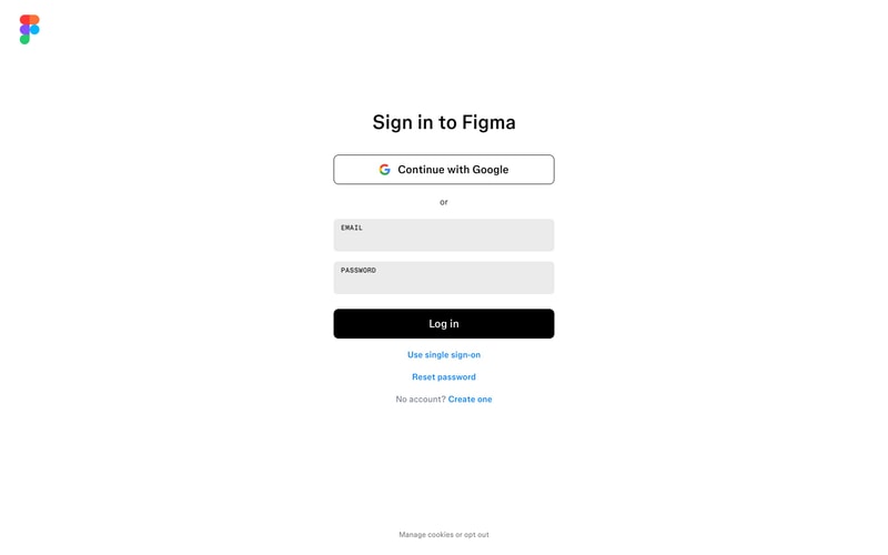
Similar styles
# Design System Reference — Figma

Extracted from Figma product website screenshots (homepage, pricing, product pages).

---

## Tokens — Colors

| Token | Hex | Usage |
|-------|-----|-------|
| `--color-brand-red` | `#F24E1E` | Figma logo, brand accent |
| `--color-brand-purple` | `#A259FF` | Figma logo, brand accent |
| `--color-brand-blue` | `#1ABCFE` | Figma logo, brand accent |
| `--color-brand-green` | `#0ACF83` | Figma logo, brand accent, badges |
| `--color-brand-yellow` | `#FBF158` | Figma logo, brand accent |
| `--color-primary` | `#5551FF` | Primary CTA buttons (Get started) |
| `--color-black` | `#000000` | Primary text, button fills |
| `--color-white` | `#FFFFFF` | Backgrounds, button text |
| `--color-gray-900` | `#2C2C2C` | Body text |
| `--color-gray-600` | `#666666` | Secondary text |
| `--color-gray-300` | `#E5E5E5` | Borders, dividers |
| `--color-gray-100` | `#F7F7F7` | Subtle backgrounds |
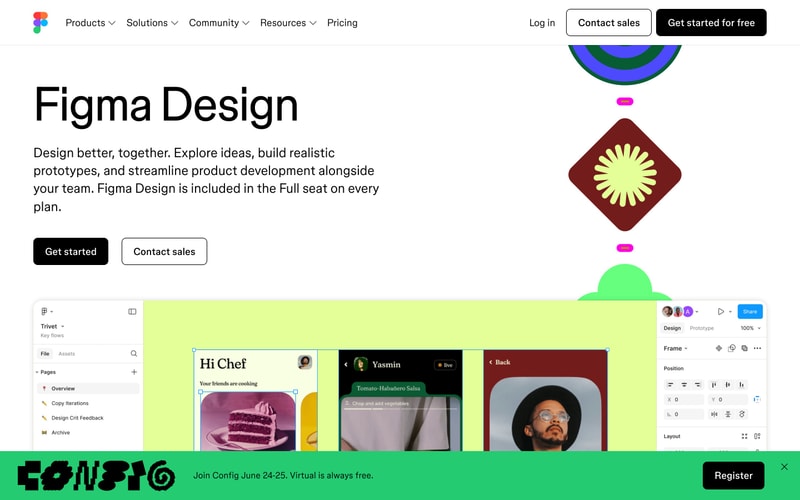
| `--color-accent-green` | `#C1F96A` | Section backgrounds (Figma Design) |
| `--color-accent-purple` | `#B4A0FF` | Illustration accents |
| `--color-accent-pink` | `#FF7AB8` | Illustration accents |
| `--color-badge-green` | `#0ACF83` | NEW badge background |

---

## Tokens — Typography

**Font Family:**
- Primary: `Inter, -apple-system, BlinkMacSystemFont, "Segoe UI", Roboto, sans-serif`

**Type Scale:**

| Token | Size | Weight | Line Height | Usage |
|-------|------|--------|-------------|-------|
| `--font-display-xl` | 96px | 700 | 1.0 | Large hero headings |
| `--font-display-lg` | 72px | 700 | 1.1 | Hero headings |
| `--font-heading-xl` | 64px | 600 | 1.1 | Page headings |
| `--font-heading-lg` | 48px | 600 | 1.2 | Section headings |
| `--font-heading-md` | 36px | 600 | 1.2 | Subsection headings |
| `--font-body-lg` | 20px | 400 | 1.6 | Large body text, descriptions |
| `--font-body` | 16px | 400 | 1.5 | Body text |
| `--font-body-sm` | 14px | 400 | 1.4 | Small text, captions |
| `--font-nav` | 16px | 500 | 1.5 | Navigation links |
| `--font-button` | 16px | 600 | 1.0 | Button text |

---

## Tokens — Spacing

Based on 8px grid system:

| Token | Value | Usage |
|-------|-------|-------|
| `--space-1` | 8px | Tight spacing |
| `--space-2` | 16px | Small gaps |
| `--space-3` | 24px | Medium gaps |
| `--space-4` | 32px | Large gaps |
| `--space-6` | 48px | Section spacing |
| `--space-8` | 64px | Large section spacing |
| `--space-10` | 80px | XL section padding |
| `--space-15` | 120px | XXL section padding |

---

## Tokens — Border Radius

| Token | Value | Usage |
|-------|-------|-------|
| `--radius-sm` | 4px | Small elements |
| `--radius-md` | 8px | Buttons, inputs |
| `--radius-lg` | 12px | Cards, panels |
| `--radius-xl` | 16px | Large cards |

---

## Tokens — Shadows

| Token | Value | Usage |
|-------|-------|-------|
| `--shadow-sm` | `0 1px 2px rgba(0,0,0,0.05)` | Subtle elevation |
| `--shadow-md` | `0 4px 12px rgba(0,0,0,0.08)` | Cards, dropdowns |
| `--shadow-lg` | `0 8px 24px rgba(0,0,0,0.12)` | Modals, popovers |

---

## Tokens — Borders

| Token | Value | Usage |
|-------|-------|-------|
| `--border-width` | 1px | Default borders |
| `--border-width-thick` | 2px | Emphasis borders |
| `--border-color` | `#E5E5E5` | Default border color |
| `--border-color-dark` | `#000000` | Dark mode / emphasis |

---

## Components

### Button

**Primary Button** (black):
- Background: `--color-black`
- Text: `--color-white`
- Padding: `12px 24px`
- Border radius: `--radius-md` (8px)
- Font: `--font-button` (16px, 600 weight)
- Hover: Slight opacity change or scale

**Secondary Button** (outline):
- Background: `--color-white`
- Text: `--color-black`
- Border: `1px solid --color-black`
- Padding: `12px 24px`
- Border radius: `--radius-md` (8px)
- Font: `--font-button`

**CTA Button** (blue):
- Background: `--color-primary` (#5551FF)
- Text: `--color-white`
- Padding: `12px 24px`
- Border radius: `--radius-md`

### Badge

- Background: `--color-badge-green` or other accent
- Text: Darker shade or white
- Padding: `4px 8px`
- Border radius: `--radius-sm` (4px)
- Font size: `12px`
- Font weight: `600`
- Text transform: `uppercase`

### Navigation

**Header Navigation:**
- Height: `~80px`
- Background: `--color-white`
- Box shadow: `--shadow-sm`
- Sticky positioning
- Max width: `1400px` centered
- Items: Logo (left), Nav links (center-left), Auth buttons (right)

**Nav Link:**
- Font: `--font-nav` (16px, 500 weight)
- Color: `--color-gray-900`
- Padding: `8px 16px`
- Hover: Underline or color change
- Dropdown indicator: Chevron icon

### Card

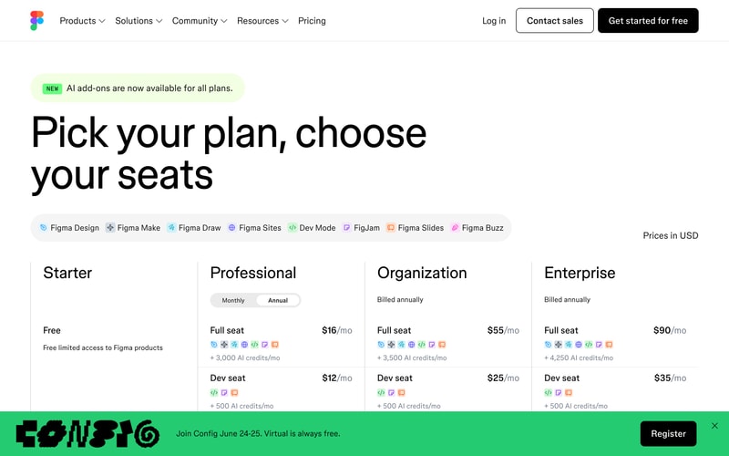
**Pricing Card:**
- Background: `--color-white`
- Border: `1px solid --color-gray-300`
- Border radius: `--radius-lg` (12px)
- Padding: `32px`
- Shadow: `--shadow-md` on hover

### Tab/Pill Navigation

- Background: `--color-gray-100`
- Active: `--color-white` with shadow
- Padding: `8px 16px`
- Border radius: `--radius-md`
- Display: Inline flex
- Gap: `8px`

---

## Layout Patterns

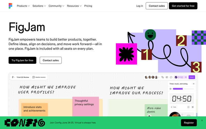
### Hero Section

- Max width: `1400px`
- Padding: `120px 48px`
- Text alignment: Center
- Heading + description + CTA button(s)
- Two-column variant: Text left (60%), visual right (40%)

### Two-Column Layout

- Grid: `60% / 40%` or `50% / 50%`
- Gap: `64px` or `80px`
- Vertical alignment: Center
- Responsive: Stacks on mobile

### Pricing Table

- Grid: 4 columns (equal width)
- Gap: `24px`
- Responsive: Scrollable horizontal on mobile
- Sticky header for comparisons

### Container

- Max width: `1400px`
- Horizontal padding: `48px` (desktop), `24px` (mobile)
- Margin: `0 auto`

---

## Animation & Motion

- Button hover: Subtle scale (1.02) or opacity change
- Hero carousel: Fade/slide transitions
- Navigation dropdown: Fade in with slide down
- Scroll animations: Fade up with slight translate

---

## Accessibility Notes

- High contrast text on backgrounds (WCAG AA+)
- Focus states visible on interactive elements
- Semantic HTML structure
- Alt text on images
- Keyboard navigation support