Use this design system
Tokens · motion · components — drop straight into your project.
Download design kitStart a project with it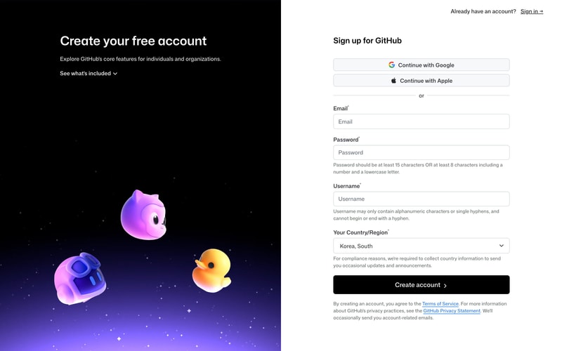
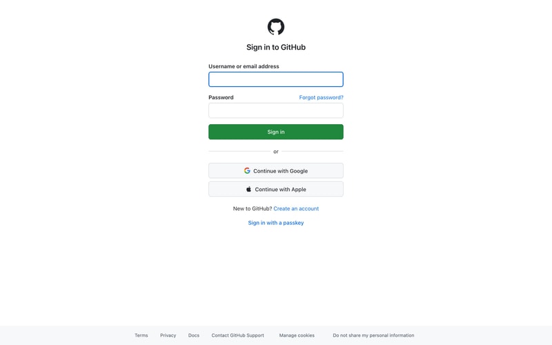
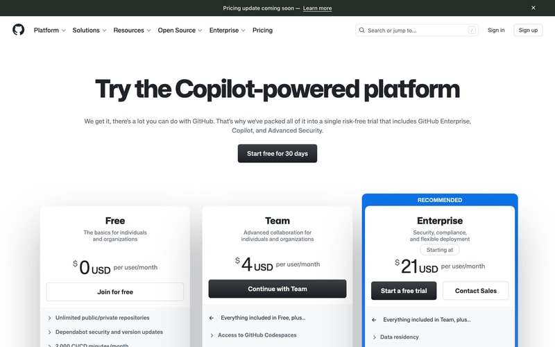
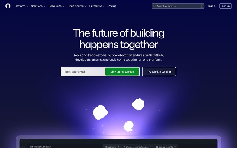
Similar styles
# GitHub Design System

## Tokens — Colors

### Dark Theme
| Token | Hex | Usage |
|-------|-----|-------|
| `canvas-default` | `#0d1117` | Main dark background (hero, navigation) |
| `canvas-inset` | `#010409` | Deeper background (Copilot page) |
| `canvas-subtle` | `#161b22` | Elevated surfaces |
| `fg-default` | `#e6edf3` | Primary text on dark |
| `fg-muted` | `#7d8590` | Secondary text on dark |
| `fg-subtle` | `#6e7681` | Tertiary text on dark |
| `border-default` | `#30363d` | Default borders on dark |
| `border-muted` | `#21262d` | Subtle borders |

### Light Theme
| Token | Hex | Usage |
|-------|-----|-------|
| `canvas-default` | `#ffffff` | Main light background |
| `canvas-subtle` | `#f6f8fa` | Subtle background |
| `fg-default` | `#1f2328` | Primary text on light |
| `fg-muted` | `#636c76` | Secondary text on light |
| `fg-subtle` | `#6e7781` | Tertiary text on light |
| `border-default` | `#d0d7de` | Default borders on light |
| `border-muted` | `#d8dee4` | Subtle borders |

### Brand & Accent Colors
| Token | Hex | Usage |
|-------|-----|-------|
| `success-emphasis` | `#2da44e` | Primary green CTA, brand actions |
| `success-fg` | `#1f883d` | Green text, hover states |
| `accent-emphasis` | `#0969da` | Primary blue, links |
| `accent-fg` | `#0366d6` | Blue text, hover |
| `done-emphasis` | `#a371f7` | Purple accents |
| `sponsors-emphasis` | `#bf3989` | Pink accents |
| `severe-fg` | `#fb8500` | Orange/warning |

### Gradient Colors
| Token | Hex | Usage |
|-------|-----|-------|
| `gradient-purple-start` | `#8957e5` | Hero gradient start |
| `gradient-purple-mid` | `#6e40c9` | Gradient middle |
| `gradient-blue-end` | `#0969da` | Hero gradient end |
| `gradient-cyan` | `#39c5cf` | Accent gradient |

## Tokens — Typography

### Font Families
- **System Stack**: `-apple-system, BlinkMacSystemFont, "Segoe UI", "Noto Sans", Helvetica, Arial, sans-serif, "Apple Color Emoji", "Segoe UI Emoji"`
- **Monospace**: `"SF Mono", ui-monospace, SFMono-Regular, Consolas, "Liberation Mono", Menlo, monospace`

### Type Scale
| Token | Size | Line Height | Weight | Usage |
|-------|------|-------------|--------|-------|
| `display-xl` | 72px | 1.1 | 600 | Hero titles (mobile: 48px) |
| `display-lg` | 56px | 1.2 | 600 | Large headings |
| `display-md` | 40px | 1.2 | 600 | Section headings |
| `heading-xl` | 32px | 1.25 | 600 | Page headings |
| `heading-lg` | 24px | 1.33 | 600 | Card headings |
| `heading-md` | 20px | 1.4 | 600 | Subheadings |
| `body-lg` | 16px | 1.5 | 400 | Body text, descriptions |
| `body-md` | 14px | 1.43 | 400 | Default body |
| `body-sm` | 12px | 1.33 | 400 | Captions, labels |

## Tokens — Spacing

8px base grid system:
- `4px` (0.25rem) — micro spacing
- `8px` (0.5rem) — xs
- `12px` (0.75rem) — sm
- `16px` (1rem) — md (base)
- `24px` (1.5rem) — lg
- `32px` (2rem) — xl
- `48px` (3rem) — 2xl
- `64px` (4rem) — 3xl
- `96px` (6rem) — 4xl
- `128px` (8rem) — 5xl

## Tokens — Border Radius
- `3px` — small (pills, tags)
- `6px` — medium (buttons, inputs, cards)
- `12px` — large (pricing cards, modals)

## Tokens — Shadows
- `shadow-sm`: `0 1px 0 rgba(27,31,36,0.04)`
- `shadow-md`: `0 3px 6px rgba(140,149,159,0.15)`
- `shadow-lg`: `0 8px 24px rgba(140,149,159,0.2)`
- `shadow-xl`: `0 12px 48px rgba(31,35,40,0.12)`

## Tokens — Borders
- `border-width`: `1px` (default)
- `border-style`: `solid`

## Components

### Navigation Bar
- Height: 64px
- Background: `canvas-default` with `backdrop-blur`
- Horizontal padding: 16px (mobile), 32px (desktop)
- Logo size: 32px
- Link spacing: 16px gap
- Dropdown indicators: chevron icons

### Buttons

**Primary (Green)**
- Background: `#2da44e`
- Text: `#ffffff`
- Padding: `12px 16px` (md), `16px 24px` (lg)
- Border radius: `6px`
- Font weight: 600
- Hover: `#1f883d`

**Secondary (Outlined)**
- Border: `1px solid border-default`
- Background: `transparent`
- Text: `fg-default`
- Padding: `12px 16px`
- Border radius: `6px`
- Hover: background `canvas-subtle`

**Dark (Sign in)**
- Background: `#1f2328`
- Text: `#ffffff`
- Padding: `12px 16px`
- Border radius: `6px`

### Form Inputs
- Height: 32px (sm), 40px (md), 48px (lg)
- Border: `1px solid #d0d7de` (light), `1px solid #30363d` (dark)
- Border radius: `6px`
- Padding: `8px 12px`
- Focus: `2px solid #0969da`, inner shadow
- Font size: 14px

### Cards

**Pricing Card**
- Background: `#ffffff` (light), `#161b22` (dark)
- Border: `1px solid #d0d7de` (light), `1px solid #30363d` (dark)
- Border radius: `12px`
- Padding: `32px`
- Shadow: `shadow-md`

**Recommended Badge**
- Background: `#0969da`
- Text: `#ffffff`
- Padding: `4px 8px`
- Border radius: `6px 6px 0 0`
- Font size: 12px
- Font weight: 700

### Pill Tabs
- Height: 40px
- Padding: `8px 16px`
- Border radius: `6px`
- Active background: `canvas-subtle` (light), `#30363d` (dark)
- Active text: `fg-default`
- Inactive text: `fg-muted`

### Hero Section
- Padding: `96px 24px` (mobile), `128px 48px` (desktop)
- Text align: center
- Heading margin bottom: 16px
- Description margin bottom: 32px
- Max width: 1280px
- Background: gradient overlay on dark

## Layout Patterns

### Page Layout
- Max width: `1280px`
- Horizontal padding: `24px` (mobile), `48px` (tablet), `64px` (desktop)
- Vertical rhythm: `64px` section spacing

### Grid System
- 12-column grid
- Gap: `24px` (mobile), `32px` (desktop)
- Pricing cards: 3 columns on desktop, 1 column on mobile

### Responsive Breakpoints
- Mobile: `< 768px`
- Tablet: `768px - 1023px`
- Desktop: `≥ 1024px`
- Wide: `≥ 1280px`

### Content Widths
- Text content: max `768px`
- Card grids: max `1280px`
- Full width: `100%`