Use this design system
Tokens · motion · components — drop straight into your project.
Download design kitStart a project with it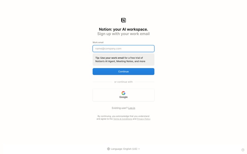
Similar styles
# Notion Design System

## Tokens — Colors

| Token | Value | Usage |
|-------|-------|-------|
| `navy-950` | `#00112B` | Dark hero background |
| `navy-900` | `#001D3D` | Dark surface background |
| `blue-600` | `#0B6FFF` | Primary CTA, links, active states |
| `blue-500` | `#4F7CE5` | Primary button hover |
| `blue-400` | `#6B8EF7` | Secondary accent |
| `blue-100` | `#E8F0FF` | Light blue backgrounds |
| `purple-500` | `#7B61FF` | Todo status, accent |
| `yellow-500` | `#FFB84D` | In-progress status, warnings |
| `green-500` | `#2ECC40` | Complete status, success |
| `red-500` | `#E85D4A` | Alerts, critical states |
| `cyan-500` | `#00A6ED` | Review status, info |
| `white` | `#FFFFFF` | Background, text on dark |
| `black` | `#000000` | Headings, primary text |
| `gray-900` | `#1A1A1A` | Dark text |
| `gray-700` | `#3D3D3D` | Secondary text |
| `gray-500` | `#6B6B6B` | Muted text |
| `gray-400` | `#999999` | Placeholder text |
| `gray-300` | `#CCCCCC` | Disabled text |
| `gray-200` | `#E6E6E6` | Borders, dividers |
| `gray-100` | `#F5F5F5` | Subtle backgrounds |
| `gray-50` | `#FAFAFA` | Card backgrounds |

## Tokens — Typography

**Font Families:**
- Primary: `-apple-system, BlinkMacSystemFont, "Segoe UI", Helvetica, Arial, sans-serif`
- Monospace: `"SF Mono", Monaco, "Cascadia Code", "Roboto Mono", monospace`

**Type Scale:**

| Token | Size | Line Height | Weight | Usage |
|-------|------|-------------|--------|-------|
| `display-xl` | 72px | 1.1 | 700 | Hero headings |
| `display-lg` | 60px | 1.15 | 700 | Large headings |
| `display-md` | 48px | 1.2 | 700 | Page headings |
| `heading-xl` | 36px | 1.25 | 700 | Section headings |
| `heading-lg` | 30px | 1.3 | 700 | Card headings |
| `heading-md` | 24px | 1.35 | 600 | Subheadings |
| `heading-sm` | 20px | 1.4 | 600 | Small headings |
| `body-lg` | 18px | 1.6 | 400 | Large body text |
| `body-md` | 16px | 1.5 | 400 | Default body text |
| `body-sm` | 14px | 1.45 | 400 | Small body text |
| `label-md` | 14px | 1.4 | 500 | Form labels, buttons |
| `label-sm` | 12px | 1.3 | 500 | Small labels, badges |
| `caption` | 11px | 1.35 | 400 | Captions, helper text |

## Tokens — Spacing

Base unit: `4px`

| Token | Value | Usage |
|-------|-------|-------|
| `xs` | 4px | Tight spacing, icon gaps |
| `sm` | 8px | Compact spacing |
| `md` | 12px | Default inline spacing |
| `lg` | 16px | Standard padding |
| `xl` | 24px | Card padding, section gaps |
| `2xl` | 32px | Large spacing |
| `3xl` | 48px | Section spacing |
| `4xl` | 64px | Hero spacing |
| `5xl` | 96px | Page-level spacing |
| `6xl` | 128px | Extra large gaps |

## Tokens — Border Radius

| Token | Value | Usage |
|-------|-------|-------|
| `sm` | 4px | Small elements, badges |
| `md` | 6px | Buttons, inputs |
| `lg` | 8px | Cards, modals |
| `xl` | 12px | Large cards, images |
| `2xl` | 16px | Feature cards |
| `full` | 9999px | Pills, avatars |

## Tokens — Shadows

| Token | Value | Usage |
|-------|-------|-------|
| `xs` | `0 1px 2px rgba(0,0,0,0.05)` | Subtle elevation |
| `sm` | `0 1px 3px rgba(0,0,0,0.1), 0 1px 2px rgba(0,0,0,0.06)` | Cards, dropdowns |
| `md` | `0 4px 6px rgba(0,0,0,0.07), 0 2px 4px rgba(0,0,0,0.05)` | Modals, popovers |
| `lg` | `0 10px 15px rgba(0,0,0,0.1), 0 4px 6px rgba(0,0,0,0.05)` | Elevated surfaces |
| `xl` | `0 20px 25px rgba(0,0,0,0.1), 0 10px 10px rgba(0,0,0,0.04)` | Floating elements |
| `blue` | `0 0 0 3px rgba(11,111,255,0.15)` | Focus ring |

## Tokens — Borders

| Token | Value | Usage |
|-------|-------|-------|
| `default` | `1px solid #E6E6E6` | Standard border |
| `thick` | `2px solid #E6E6E6` | Emphasized border |
| `focus` | `2px solid #0B6FFF` | Focus state |
| `error` | `1px solid #E85D4A` | Error state |

## Components

### Button
- **Primary**: Blue background (#0B6FFF), white text, 6px radius, 12px 24px padding
- **Secondary**: White background, blue border, blue text
- **Ghost**: Transparent background, gray text on hover
- **Sizes**: Small (32px height), Medium (40px height), Large (48px height)
- **States**: Hover (darker blue), Active (even darker), Disabled (gray, 50% opacity)

### Input Field
- **Default**: White background, gray border (#E6E6E6), 6px radius
- **Focus**: Blue border (#0B6FFF), blue shadow ring
- **Error**: Red border (#E85D4A)
- **Padding**: 12px 16px, height 40px

### Card
- **Background**: White (#FFFFFF)
- **Border**: 1px solid #E6E6E6
- **Radius**: 8-12px
- **Padding**: 24px
- **Shadow**: Subtle (0 1px 3px rgba(0,0,0,0.1))

### Badge
- **Recommended**: Blue background (#0B6FFF), white text, 4px radius
- **Status**: Colored dot + text (purple/yellow/green/cyan)
- **Padding**: 4px 8px
- **Font**: 12px, 500 weight

### Navigation
- **Height**: 64px
- **Background**: Transparent (dark hero) or white
- **Links**: 14px text, 500 weight, 8px spacing
- **Logo**: 32px height

### Sidebar
- **Width**: 240px
- **Item height**: 32px
- **Icon size**: 16px
- **Padding**: 8px 12px per item
- **Hover**: Light gray background (#F5F5F5)
- **Active**: Blue background (#E8F0FF), blue text

### Kanban Column
- **Width**: ~280px
- **Gap**: 16px between columns
- **Card**: White background, 1px border, 8px radius, 12px padding
- **Header**: Status badge + count
- **Spacing**: 8px between cards

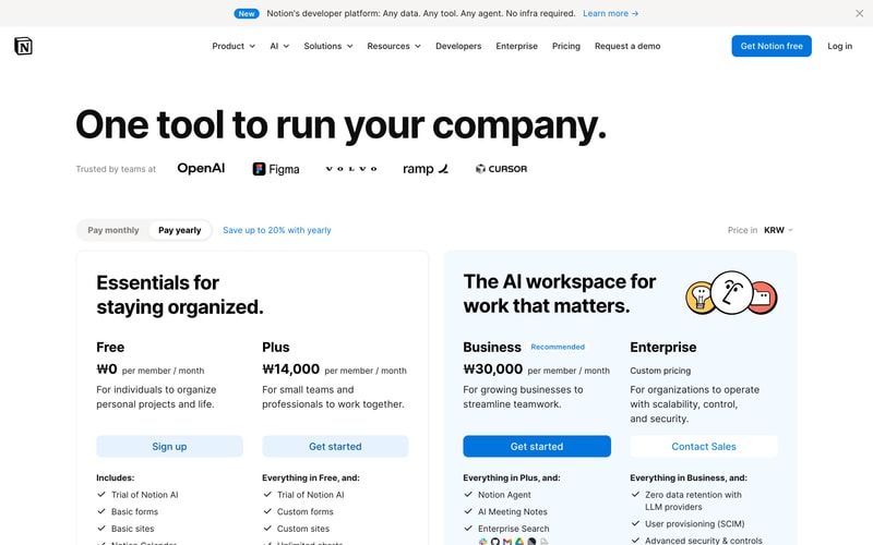
### Pricing Card
- **Background**: White
- **Border**: 1px solid #E6E6E6 (or thicker for recommended)
- **Radius**: 12px
- **Padding**: 32px 24px
- **Price**: 36px bold
- **CTA**: Full-width button

## Layout Patterns

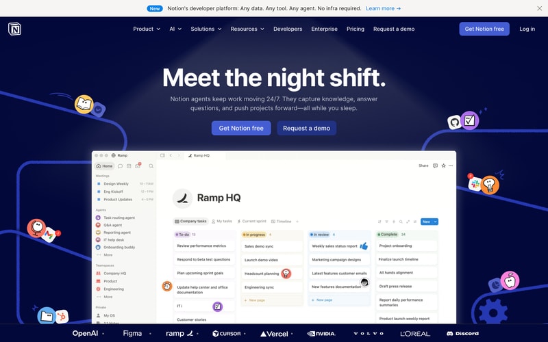
### Hero Section
- **Container**: Full-width with max-width ~1280px
- **Padding**: 64px vertical, 24px horizontal
- **Text alignment**: Center
- **Heading**: 60-72px display font
- **Subheading**: 18px body text, max-width 600px centered
- **CTA spacing**: 16px gap between buttons
- **Background**: Gradient radial effect on dark navy

### Pricing Grid
- **Grid**: 4 columns on desktop, responsive
- **Gap**: 24px
- **Max-width**: 1200px
- **Card min-height**: Auto, aligned tops

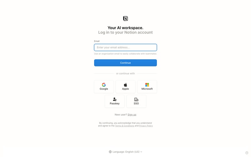
### Centered Auth Form
- **Max-width**: 400px
- **Padding**: 48px 24px
- **Vertical center**: Flexbox or grid
- **Input spacing**: 16px gap
- **OAuth grid**: 3 columns, 12px gap

### Two-Column Layout
- **Left sidebar**: Fixed 240px
- **Main content**: Flexible 1fr
- **Gap**: 0 (flush)
- **Min-height**: 100vh