2 free brands left today.Sign up — unlimited →
Use this design system
Tokens · motion · components — drop straight into your project.
Download design kitStart a project with it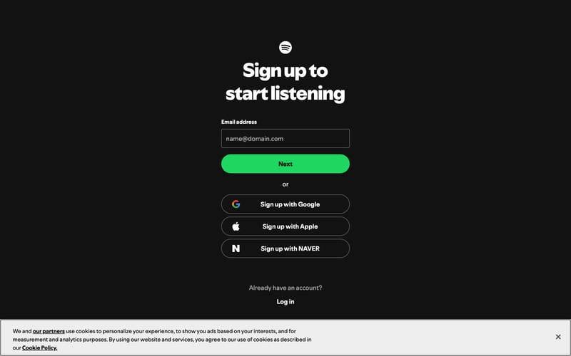
Similar styles
# Spotify Design System

## Tokens — Colors

| Token | Hex | Usage |
|-------|-----|-------|
| `color-green-primary` | `#1DB954` | Spotify brand green, primary CTA, accents |
| `color-black` | `#000000` | Headers, pure black backgrounds |
| `color-gray-950` | `#121212` | Dark theme main background |
| `color-gray-900` | `#181818` | Dark theme card/surface backgrounds |
| `color-gray-800` | `#282828` | Borders, dividers |
| `color-gray-600` | `#535353` | Tertiary text |
| `color-gray-400` | `#B3B3B3` | Secondary text, muted content |
| `color-white` | `#FFFFFF` | Primary text (dark theme), buttons, backgrounds (light theme) |
| `color-blue-primary` | `#2E77D0` | Banner backgrounds, links |
| `color-pink-light` | `#F5ABBA` | CTA buttons (marketing pages) |
| `color-yellow-bright` | `#FFE600` | Accent highlights, emphasis |
| `color-gray-50` | `#F6F6F6` | Light theme backgrounds |
| `color-overlay-dark` | `rgba(0, 0, 0, 0.6)` | Image overlays |
| `color-overlay-light` | `rgba(0, 0, 0, 0.3)` | Subtle overlays |

## Tokens — Typography

**Font Families:**
- `font-primary`: Circular, -apple-system, BlinkMacSystemFont, "Segoe UI", Roboto, sans-serif
- `font-headline`: Circular Bold, sans-serif

**Type Scale:**

| Token | Size | Line Height | Weight | Usage |
|-------|------|-------------|--------|-------|
| `text-xs` | 12px | 16px | 400 | Captions, metadata |
| `text-sm` | 14px | 20px | 400 | Body text, labels |
| `text-base` | 16px | 24px | 400 | Primary body text |
| `text-lg` | 18px | 28px | 400-600 | Subheadings |
| `text-xl` | 20px | 28px | 700 | Card titles |
| `text-2xl` | 24px | 32px | 700 | Section headings |
| `text-3xl` | 32px | 40px | 700-900 | Page titles |
| `text-4xl` | 48px | 56px | 900 | Hero headlines |
| `text-5xl` | 72px | 80px | 900 | Large display |

## Tokens — Spacing

Based on 4px base unit:

| Token | Value | Usage |
|-------|-------|-------|
| `space-1` | 4px | Tight spacing |
| `space-2` | 8px | Element gaps |
| `space-3` | 12px | Small padding |
| `space-4` | 16px | Default padding |
| `space-5` | 20px | Medium spacing |
| `space-6` | 24px | Section spacing |
| `space-8` | 32px | Large spacing |
| `space-10` | 40px | XL spacing |
| `space-12` | 48px | Section padding |
| `space-16` | 64px | Hero spacing |

## Tokens — Border Radius

| Token | Value | Usage |
|-------|-------|-------|
| `radius-sm` | 4px | Small elements, chips |
| `radius-md` | 8px | Cards, images, inputs |
| `radius-lg` | 16px | Large cards |
| `radius-xl` | 24px | CTAs, prominent buttons |
| `radius-full` | 9999px | Circular avatars, pills |

## Tokens — Shadows

| Token | Value | Usage |
|-------|-------|-------|
| `shadow-sm` | `0 1px 2px rgba(0,0,0,0.1)` | Subtle elevation |
| `shadow-md` | `0 4px 12px rgba(0,0,0,0.15)` | Card hover states |
| `shadow-lg` | `0 8px 24px rgba(0,0,0,0.2)` | Modals, dropdowns |
| `shadow-xl` | `0 16px 48px rgba(0,0,0,0.3)` | Hero elements |

## Tokens — Borders

| Token | Value | Usage |
|-------|-------|-------|
| `border-thin` | 1px solid #282828 | Dividers (dark theme) |
| `border-medium` | 2px solid #FFFFFF | Focus states |
| `border-light` | 1px solid #E0E0E0 | Light theme dividers |

## Components

### Navigation (Sidebar)
- Background: `#000000`
- Width: ~240px fixed
- Padding: 24px
- Link text: `#B3B3B3`, hover: `#FFFFFF`
- Active state: `#FFFFFF` with green indicator

### Search Input
- Background: `#282828` (dark), `#FFFFFF` (light)
- Placeholder: `#B3B3B3`
- Height: 40px
- Border radius: 24px (pill)
- Padding: 8px 48px 8px 16px
- Icon: Right-aligned magnifying glass

### Buttons

**Primary:**
- Background: `#1DB954`
- Text: `#FFFFFF`
- Padding: 12px 32px
- Border radius: 24px
- Font weight: 700
- Hover: Slightly lighter green

**Secondary (White):**
- Background: `#FFFFFF`
- Text: `#000000`
- Border radius: 24px
- Padding: 12px 32px
- Font weight: 700

**Secondary (Pink):**
- Background: `#F5ABBA`
- Text: `#000000`
- Border radius: 24px

**Ghost:**
- Background: transparent
- Text: `#FFFFFF` or `#000000`
- Border: 1px solid current color

### Media Cards
- Aspect ratio: 1:1 (square) for albums/artists
- Border radius: 8px on images
- Padding: 16px
- Background: `#181818` (hover: `#282828`)
- Text: 14px title + 12px subtitle
- Transition: background 0.3s ease

### Grid Layouts
- Columns: 5-6 for desktop, responsive
- Gap: 24px
- Min card width: ~180px

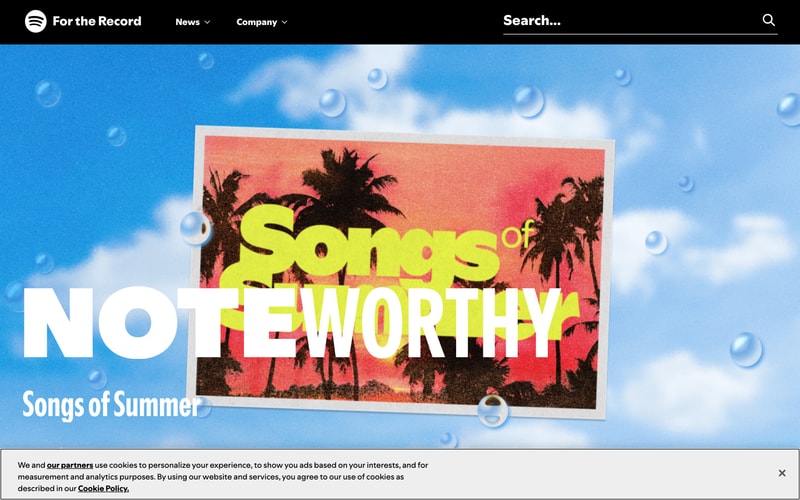
### Cookie Banner
- Background: `#F6F6F6` (light theme), `#282828` (dark theme)
- Border top: 1px solid border color
- Padding: 16px 24px
- Fixed bottom position
- Close button: Right-aligned X icon

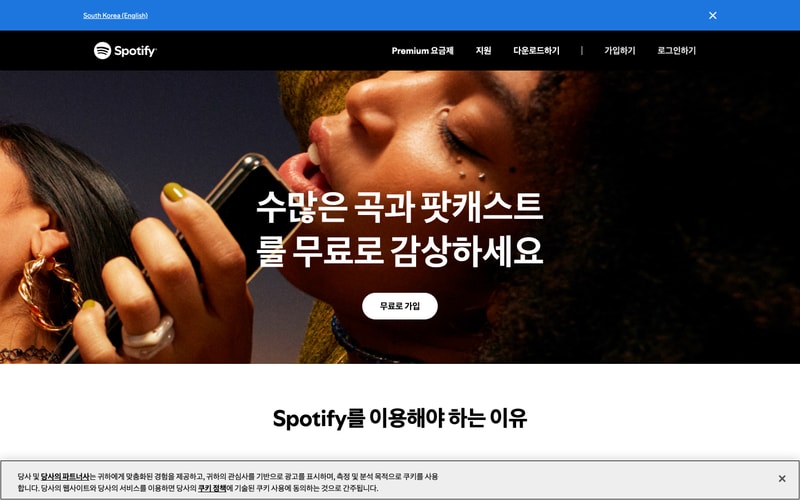
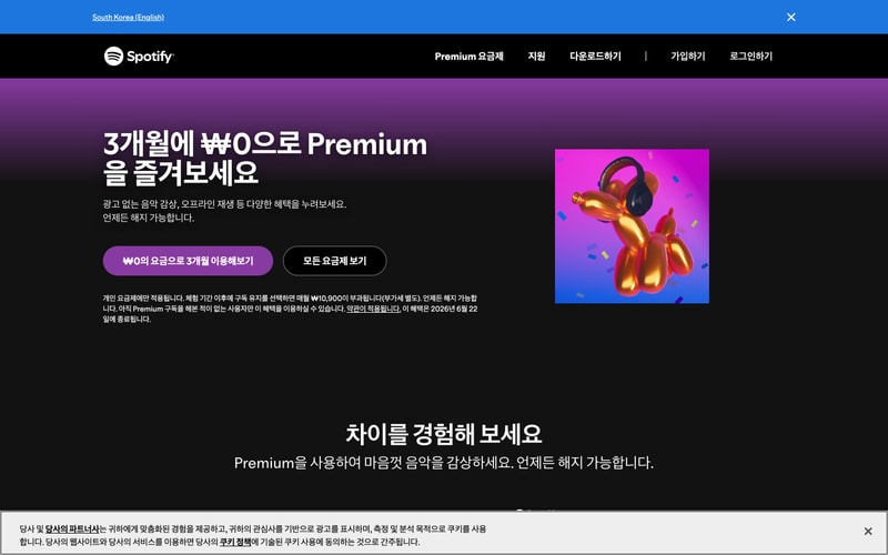
### Header (Marketing Pages)
- Background: `#000000`
- Height: 80px
- Logo: Left, white
- Nav links: Right, white, 14px, spacing 24px
- Buttons: "Log in" ghost, "Sign up" white/pink

## Layout Patterns

### App Layout (Dark Theme)
- Sidebar (240px) + Main content area (flex-1)
- Sidebar: Fixed, full height
- Main: Scrollable, padding 16-32px
- Max-width content sections: ~1400px

### Marketing Page Hero
- Full viewport height
- Two-column: Text left (40%), Visual right (60%)
- Background: Image or gradient
- Text overlay with contrast

### Content Grid
- CSS Grid or Flexbox
- 5-6 columns desktop, 3-4 tablet, 2 mobile
- Gap: 24px
- Auto-fill pattern

### Sticky Header
- Position: sticky, top: 0
- z-index: 100
- Backdrop blur on scroll (optional)