Use this design system
Tokens · motion · components — drop straight into your project.
Download design kitStart a project with it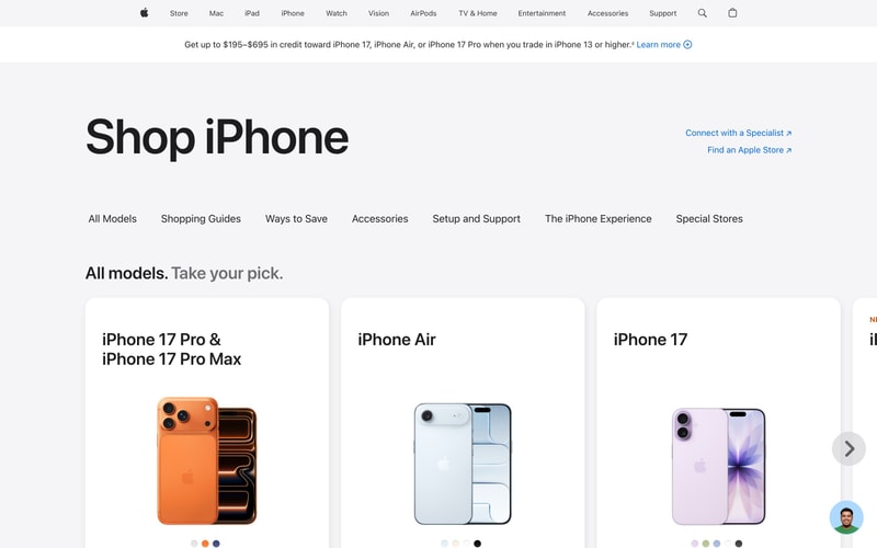

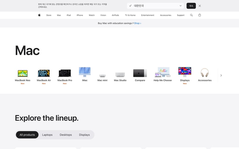
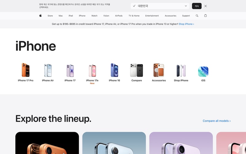
Similar styles
# Apple Design System

## Tokens — Colors

| Token | Value | Usage |
|-------|-------|-------|
| `blue-primary` | `#0071e3` | Primary CTA buttons, links |
| `black` | `#1d1d1f` | Headings, primary text on light backgrounds |
| `white` | `#ffffff` | Text on dark backgrounds, component backgrounds |
| `gray-50` | `#f5f5f7` | Light background surfaces |
| `gray-100` | `#e8e8ed` | Subtle borders, dividers |
| `gray-600` | `#6e6e73` | Secondary text, muted content |
| `gray-900` | `#000000` | Dark mode backgrounds, pure black surfaces |
| `red-accent` | `#ff3b30` | "New" badges, alerts |
| `orange-accent` | `#ff9500` | Accent decorations |
| `pink-accent` | `#ff2d55` | Decorative illustrations |
| `yellow-accent` | `#ffcc00` | Decorative illustrations |

## Tokens — Typography

**Font Families:**
- **Display**: SF Pro Display (headings, large text)
- **Text**: SF Pro Text (body copy, UI elements)
- **Mono**: SF Mono (code, technical specifications)

**Type Scale:**

| Token | Size | Line Height | Weight | Usage |
|-------|------|-------------|--------|-------|
| `display-xl` | 96px | 1.05 | 700 | Hero headings |
| `display-lg` | 80px | 1.05 | 700 | Major section headings |
| `display-md` | 64px | 1.0625 | 700 | Page titles |
| `heading-xl` | 56px | 1.07 | 700 | Section headings |
| `heading-lg` | 48px | 1.08 | 700 | Subsection headings |
| `heading-md` | 40px | 1.1 | 600 | Card headings |
| `heading-sm` | 32px | 1.125 | 600 | Small headings |
| `body-xl` | 21px | 1.38 | 400 | Large body text |
| `body-lg` | 17px | 1.47 | 400 | Standard body text |
| `body-md` | 14px | 1.43 | 400 | Secondary body text |
| `body-sm` | 12px | 1.33 | 400 | Captions, labels |
| `nav` | 12px | 1.33 | 400 | Navigation links |

## Tokens — Spacing

| Token | Value | Usage |
|-------|-------|-------|
| `space-1` | 4px | Tight spacing, icon padding |
| `space-2` | 8px | Small gaps between related items |
| `space-3` | 12px | Component internal padding |
| `space-4` | 16px | Standard spacing unit |
| `space-5` | 20px | Medium gaps |
| `space-6` | 24px | Large component padding |
| `space-8` | 32px | Section spacing |
| `space-10` | 40px | Large section spacing |
| `space-12` | 48px | Extra large spacing |
| `space-16` | 64px | Hero section spacing |
| `space-20` | 80px | Major section dividers |
| `space-24` | 96px | Largest spacing between major sections |

## Tokens — Radii

| Token | Value | Usage |
|-------|-------|-------|
| `radius-sm` | 4px | Small elements, badges |
| `radius-md` | 8px | Buttons, input fields |
| `radius-lg` | 12px | Cards, modals |
| `radius-xl` | 18px | Large cards, product images |
| `radius-pill` | 980px | Pill buttons, toggles |

## Tokens — Shadows

| Token | Value | Usage |
|-------|-------|-------|
| `shadow-sm` | `0 1px 3px rgba(0,0,0,0.08)` | Subtle elevation |
| `shadow-md` | `0 4px 12px rgba(0,0,0,0.1)` | Cards, dropdowns |
| `shadow-lg` | `0 8px 24px rgba(0,0,0,0.12)` | Modals, overlays |
| `shadow-xl` | `0 16px 48px rgba(0,0,0,0.16)` | Maximum elevation |

## Tokens — Borders

| Token | Value | Usage |
|-------|-------|-------|
| `border-width` | 1px | Standard borders |
| `border-color-light` | `#d2d2d7` | Light theme borders |
| `border-color-dark` | `#424245` | Dark theme borders |

## Components

### Navigation Bar
- Height: 44px
- Background: Semi-transparent with backdrop blur (light: rgba(255,255,255,0.8), dark: rgba(0,0,0,0.8))
- Horizontal padding: 16px
- Logo size: 16px
- Link spacing: 32px between items
- Font: SF Pro Text, 12px, 400 weight

### Button — Primary
- Background: `#0071e3` (blue-primary)
- Color: white
- Padding: 12px 24px
- Border radius: 980px (pill)
- Font: SF Pro Text, 17px, 400 weight
- Hover: Slightly darker blue (#0077ed)

### Button — Secondary
- Background: transparent
- Color: `#0071e3`
- Border: 1px solid currentColor
- Padding: 12px 24px
- Border radius: 980px

### Product Card
- Background: white (light) or `#1d1d1f` (dark)
- Padding: 24px
- Border radius: 18px
- Image aspect ratio: 1:1 or 4:3
- Title: SF Pro Display, 24px, 600 weight
- Badge: Red/orange pill with "New"

### Badge — New
- Background: `#ff3b30`
- Color: white
- Padding: 2px 8px
- Border radius: 4px
- Font: SF Pro Text, 12px, 600 weight

### Pill Toggle
- Background: light gray (#e8e8ed) when inactive
- Background: black (#000000) when active
- Color: black when inactive, white when active
- Padding: 8px 16px
- Border radius: 980px
- Font: SF Pro Text, 14px, 400 weight

### Hero Section
- Max width: 980px centered
- Padding: 80px 16px
- Heading: 96px, SF Pro Display, 700 weight
- Subheading: 21px, SF Pro Text, 400 weight
- CTA margin-top: 24px

### Product Carousel
- Display: Horizontal scroll with snap points
- Gap: 16px between cards
- Padding: 0 16px
- Scroll padding: 16px
- Item width: 160px (mobile), 200px (desktop)

## Layout Patterns

### Container
- Max width: 980px (content), 1440px (wide)
- Margin: 0 auto
- Padding: 0 16px (mobile), 0 24px (tablet), 0 32px (desktop)

### Grid — Product Grid
- Columns: 2 (mobile), 4 (tablet), 6 (desktop)
- Gap: 16px
- Auto-fit minmax pattern

### Hero Layout
- Display: Flex column, centered alignment
- Text align: center
- Max width: 680px for text content

### Navigation Layout
- Display: Flex row
- Justify: space-between
- Align: center
- Sticky positioning at top
- z-index: 1000