Use this design system
Tokens · motion · components — drop straight into your project.
Download design kitStart a project with it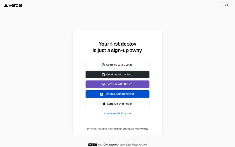
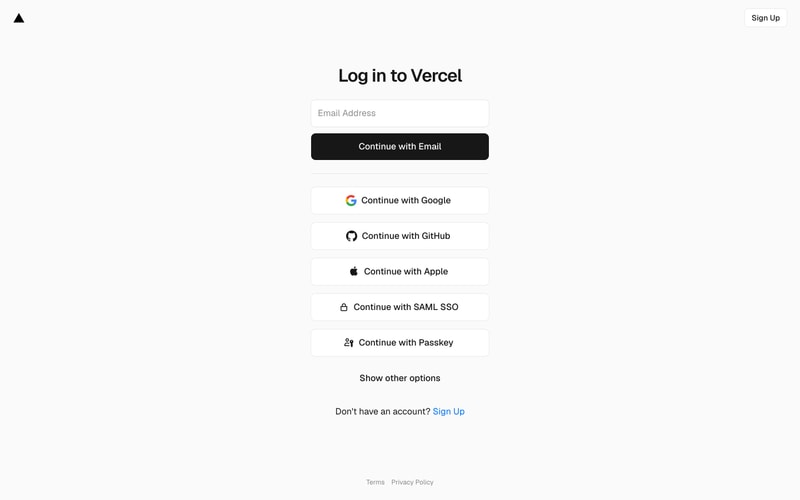
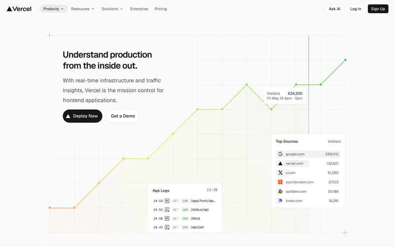
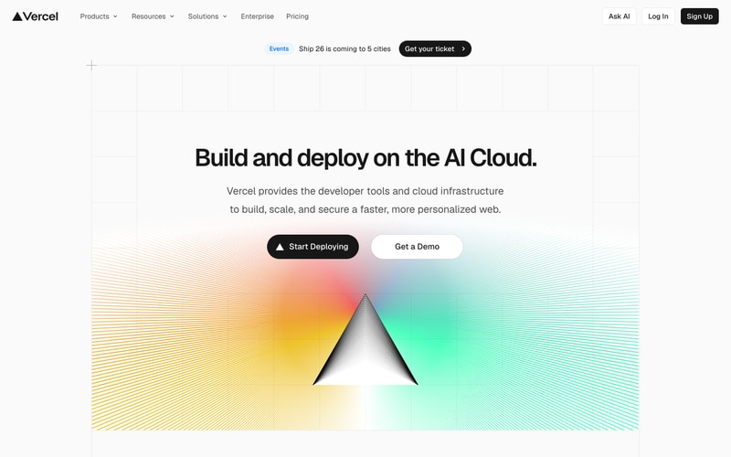
Similar styles
# Vercel Design System

## Tokens — Colors

| Token | Hex | Usage |
|-------|-----|-------|
| `black` | `#000000` | Primary text, buttons, borders |
| `white` | `#FFFFFF` | Backgrounds, button text |
| `gray-50` | `#FAFAFA` | Subtle backgrounds |
| `gray-100` | `#F5F5F5` | Card backgrounds, hover states |
| `gray-200` | `#E5E5E5` | Borders, dividers |
| `gray-300` | `#D4D4D4` | Disabled states |
| `gray-400` | `#A3A3A3` | Placeholder text |
| `gray-600` | `#525252` | Secondary text |
| `gray-700` | `#404040` | Body text |
| `gray-900` | `#171717` | Headings |
| `blue` | `#0070F3` | Links, interactive elements |
| `blue-hover` | `#0761D1` | Link hover state |
| `gradient-orange` | `#FF6B35` | Hero gradient start |
| `gradient-yellow` | `#FFC371` | Hero gradient mid |
| `gradient-pink` | `#FF5E98` | Hero gradient accent |
| `gradient-cyan` | `#4FACFE` | Hero gradient accent |
| `gradient-green` | `#00F2FE` | Hero gradient end |
| `chart-yellow` | `#FACC15` | Analytics chart start |
| `chart-green` | `#7EE787` | Analytics chart end |
| `success` | `#22C55E` | Success states |
| `warning` | `#F59E0B` | Warning states |
| `error` | `#EF4444` | Error states |

## Tokens — Typography

**Font Family:**
- Primary: `"Geist Sans", -apple-system, BlinkMacSystemFont, "Segoe UI", Roboto, sans-serif`
- Monospace: `"Geist Mono", Menlo, Monaco, "Courier New", monospace`

**Type Scale:**

| Token | Size | Line Height | Weight | Usage |
|-------|------|-------------|--------|-------|
| `hero` | `72px` | `1.1` | `700` | Hero headings |
| `h1` | `48px` | `1.2` | `700` | Page headings |
| `h2` | `36px` | `1.3` | `700` | Section headings |
| `h3` | `24px` | `1.4` | `600` | Card titles |
| `body-lg` | `18px` | `1.6` | `400` | Large body text |
| `body` | `16px` | `1.5` | `400` | Default body text |
| `body-sm` | `14px` | `1.5` | `400` | Small text, captions |
| `label` | `14px` | `1.4` | `500` | Form labels |
| `caption` | `12px` | `1.4` | `400` | Metadata, timestamps |

## Tokens — Spacing

**Base unit: 4px**

| Token | Value | Usage |
|-------|-------|-------|
| `xs` | `4px` | Tight spacing |
| `sm` | `8px` | Icon gaps, compact spacing |
| `md` | `16px` | Standard element spacing |
| `lg` | `24px` | Section padding |
| `xl` | `32px` | Card padding, major sections |
| `2xl` | `48px` | Large section gaps |
| `3xl` | `64px` | Hero section padding |
| `4xl` | `96px` | Page section spacing |

## Tokens — Border Radius

| Token | Value | Usage |
|-------|-------|-------|
| `sm` | `4px` | Badges, small elements |
| `md` | `8px` | Buttons, inputs |
| `lg` | `12px` | Cards |
| `xl` | `16px` | Large cards, modals |
| `full` | `9999px` | Pills, avatars |

## Tokens — Shadows

| Token | Value | Usage |
|-------|-------|-------|
| `sm` | `0 1px 2px rgba(0,0,0,0.05)` | Subtle elevation |
| `md` | `0 2px 8px rgba(0,0,0,0.08)` | Cards, dropdowns |
| `lg` | `0 4px 16px rgba(0,0,0,0.12)` | Modals, popovers |
| `xl` | `0 8px 32px rgba(0,0,0,0.16)` | Large modals |

## Tokens — Borders

| Token | Value | Usage |
|-------|-------|-------|
| `default` | `1px solid #E5E5E5` | Default borders |
| `hover` | `1px solid #D4D4D4` | Hover states |
| `focus` | `2px solid #0070F3` | Focus rings |

## Components

### Button

**Primary Button:**
- Background: `#000000`
- Text: `#FFFFFF`
- Padding: `12px 24px`
- Border radius: `8px`
- Font size: `16px`
- Font weight: `500`
- Hover: Slight opacity reduction to `0.9`

**Secondary Button:**
- Background: `#FFFFFF`
- Text: `#000000`
- Border: `1px solid #E5E5E5`
- Padding: `12px 24px`
- Border radius: `8px`
- Font size: `16px`
- Hover: Background `#F5F5F5`

**Icon Button:**
- Size: `40px × 40px`
- Border radius: `8px`
- Icon size: `20px`
- Hover: Background `#F5F5F5`

### Input Field

- Height: `48px`
- Padding: `12px 16px`
- Border: `1px solid #E5E5E5`
- Border radius: `8px`
- Font size: `16px`
- Placeholder color: `#A3A3A3`
- Focus: Border `#0070F3`, shadow `0 0 0 3px rgba(0,112,243,0.1)`

### Card

- Background: `#FFFFFF`
- Border: `1px solid #E5E5E5`
- Border radius: `12px`
- Padding: `24px` to `32px`
- Shadow: `0 2px 8px rgba(0,0,0,0.08)` (optional)
- Hover: Border `#D4D4D4`, shadow `0 4px 16px rgba(0,0,0,0.12)`

### Navigation

**Header:**
- Height: `64px`
- Background: `#FFFFFF`
- Border bottom: `1px solid #E5E5E5`
- Logo size: `~32px` height
- Nav items: `16px` font, `500` weight, `#525252` color
- Hover: Color `#000000`

**Dropdown Indicator:**
- Chevron icon: `16px`, rotates on open

### Banner

- Background: `#FAFAFA` or white
- Border: `1px solid #E5E5E5`
- Padding: `12px 24px`
- Border radius: `8px` to `12px`
- Text: `14px`, center aligned

### Pricing Card

- Background: `#FFFFFF`
- Border: `1px solid #E5E5E5`
- Border radius: `12px`
- Padding: `32px`
- Popular badge: Black background, white text, `8px` radius
- Feature icons: `20px`, outlined style
- Spacing between features: `16px`

### Analytics Chart

- Line weight: `2px`
- Point radius: `4px`
- Grid lines: `#F5F5F5`
- Tooltip: White background, shadow, `8px` radius
- Color gradient: Yellow to green

### Table

- Row height: `48px`
- Border: `1px solid #E5E5E5`
- Padding: `12px 16px`
- Header weight: `600`
- Zebra striping: `#FAFAFA` (optional)
- Hover: Background `#F5F5F5`

## Layout Patterns

### Hero Section

- Max width: `1200px`
- Padding: `96px 24px`
- Heading: Centered, `72px` font
- Subheading: Centered, `18px` font, `#525252` color
- Button group: `16px` gap, centered
- Background: Full-width gradient or image

### Grid System

- Container max width: `1440px`
- Columns: 12-column grid
- Gap: `24px` to `32px`
- Breakpoints:
  - Mobile: `< 768px` (1 column)
  - Tablet: `768px - 1024px` (2 columns)
  - Desktop: `> 1024px` (3+ columns)

### Content Section

- Max width: `1200px`
- Padding: `64px 24px` (vertical), responsive horizontal
- Section gap: `96px` between major sections

### Sidebar Layout

- Sidebar width: `280px` (fixed or flexible)
- Main content: `flex-grow`
- Gap: `32px`
- Responsive: Stack on mobile (< 1024px)