Use this design system
Tokens · motion · components — drop straight into your project.
Download design kitStart a project with it
Similar styles
# Linear Design System

## Design Tokens

### Colors

| Token | Value | Usage |
|-------|-------|-------|
| `--color-background-primary` | `#09090B` | Main app background, darkest surface |
| `--color-background-secondary` | `#18181B` | Elevated surfaces, cards, modals |
| `--color-background-tertiary` | `#27272A` | Subtle backgrounds, hover states |
| `--color-border-primary` | `#27272A` | Default borders, dividers |
| `--color-border-secondary` | `#3F3F46` | Hover borders, focus rings |
| `--color-text-primary` | `#FFFFFF` | Primary text, headings |
| `--color-text-secondary` | `#A1A1AA` | Secondary text, descriptions |
| `--color-text-tertiary` | `#71717A` | Tertiary text, muted content |
| `--color-text-quaternary` | `#52525B` | Disabled text, placeholders |
| `--color-accent-primary` | `#5E6AD2` | Primary accent, links, toggles |
| `--color-accent-hover` | `#6E7AE2` | Accent hover state |
| `--color-success` | `#10B981` | Success states, checkmarks |
| `--color-warning` | `#F59E0B` | Warning states, in-progress |
| `--color-error` | `#EF4444` | Error states, destructive actions |
| `--color-info` | `#3B82F6` | Info states, highlights |

### Typography

**Font Families:**
- `--font-sans`: "Inter", -apple-system, BlinkMacSystemFont, "Segoe UI", system-ui, sans-serif
- `--font-serif`: "ABC Favorit", "Times New Roman", serif
- `--font-mono`: "SF Mono", "Monaco", "Cascadia Code", monospace

**Type Scale:**

| Token | Size | Line Height | Weight | Usage |
|-------|------|-------------|--------|-------|
| `--text-xs` | 12px / 0.75rem | 16px / 1.333 | 400 | Small labels, captions |
| `--text-sm` | 14px / 0.875rem | 20px / 1.429 | 400 | Body text, UI elements |
| `--text-base` | 16px / 1rem | 24px / 1.5 | 400 | Default body text |
| `--text-lg` | 18px / 1.125rem | 28px / 1.556 | 400 | Large body text |
| `--text-xl` | 20px / 1.25rem | 28px / 1.4 | 500 | Small headings |
| `--text-2xl` | 24px / 1.5rem | 32px / 1.333 | 500 | Section headings |
| `--text-3xl` | 30px / 1.875rem | 36px / 1.2 | 600 | Page headings |
| `--text-4xl` | 36px / 2.25rem | 40px / 1.111 | 600 | Large headings |
| `--text-5xl` | 48px / 3rem | 52px / 1.083 | 600 | Hero headings |
| `--text-6xl` | 60px / 3.75rem | 64px / 1.067 | 600 | Display headings |
| `--text-7xl` | 72px / 4.5rem | 76px / 1.056 | 600 | Large display (serif) |
| `--text-8xl` | 96px / 6rem | 100px / 1.042 | 600 | Extra large display |

**Font Weights:**
- Regular: 400
- Medium: 500
- Semibold: 600
- Bold: 700

### Spacing

Based on 4px base unit:

| Token | Value |
|-------|-------|
| `--space-1` | 4px / 0.25rem |
| `--space-2` | 8px / 0.5rem |
| `--space-3` | 12px / 0.75rem |
| `--space-4` | 16px / 1rem |
| `--space-5` | 20px / 1.25rem |
| `--space-6` | 24px / 1.5rem |
| `--space-8` | 32px / 2rem |
| `--space-10` | 40px / 2.5rem |
| `--space-12` | 48px / 3rem |
| `--space-16` | 64px / 4rem |
| `--space-20` | 80px / 5rem |
| `--space-24` | 96px / 6rem |
| `--space-32` | 128px / 8rem |

### Border Radius

| Token | Value |
|-------|-------|
| `--radius-sm` | 4px |
| `--radius-md` | 6px |
| `--radius-lg` | 8px |
| `--radius-xl` | 12px |
| `--radius-2xl` | 16px |
| `--radius-full` | 9999px |

### Shadows

| Token | Value |
|-------|-------|
| `--shadow-sm` | 0 1px 2px 0 rgba(0, 0, 0, 0.3) |
| `--shadow-md` | 0 4px 6px -1px rgba(0, 0, 0, 0.4) |
| `--shadow-lg` | 0 10px 15px -3px rgba(0, 0, 0, 0.5) |
| `--shadow-xl` | 0 20px 25px -5px rgba(0, 0, 0, 0.6) |

### Borders

| Token | Value |
|-------|-------|
| `--border-width-thin` | 1px |
| `--border-width-medium` | 2px |
| `--border-width-thick` | 3px |

## Components

### Navigation Bar
- Height: 64px
- Background: `rgba(9, 9, 11, 0.95)` with backdrop blur
- Border bottom: 1px solid `#27272A`
- Padding: 0 24px
- Logo: 24px height
- Navigation links: 14px, medium gray color with white on hover
- CTA buttons: 36px height

### Buttons
- **Primary**: White background, dark text, 6px radius, 500 weight
- **Secondary**: Transparent background, 1px border, white text
- **Ghost**: No background, no border, text only
- Heights: Small (32px), Medium (36px), Large (40px)
- Padding: 12px 16px (medium)

### Cards
- Background: `#18181B`
- Border: 1px solid `#27272A`
- Border radius: 8px
- Padding: 24px

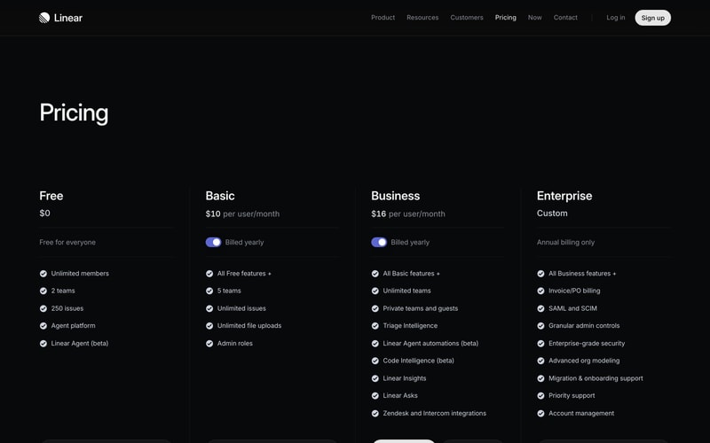
### Pricing Tier Cards
- Background: `#18181B`
- Border: 1px solid `#27272A`
- Border radius: 12px
- Padding: 32px
- Checkmarks: 20px circular icons with success color

### Toggle Switch
- Width: 44px
- Height: 24px
- Border radius: 12px (full pill)
- Active background: `#5E6AD2`
- Inactive background: `#3F3F46`
- Knob: 20px circle, white

### Sidebar Navigation
- Width: ~240px
- Background: `#09090B`
- Item height: 32px
- Item padding: 8px 12px
- Border radius: 6px
- Active state: `#18181B` background
- Icons: 16px, gray with white on active

### Status Badges
- Height: 20px
- Padding: 4px 8px
- Border radius: 4px
- Font size: 12px
- Background: Semi-transparent color
- "In Progress": Yellow/amber tones
- "High": Muted background with colored text

### Input Fields
- Height: 36px
- Background: `#18181B`
- Border: 1px solid `#27272A`
- Border radius: 6px
- Padding: 8px 12px
- Focus: Border color changes to accent

## Layout Patterns

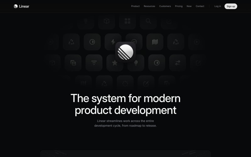
### Hero Section
- Full viewport width
- Centered content
- Max width: 1280px
- Vertical padding: 120px - 200px
- Heading + subheading + CTA pattern

### Three-Column Pricing
- Grid: 4 columns (responsive)
- Gap: 24px
- Equal height cards
- Centered alignment

### App Layout
- Sidebar (240px) + Main content
- Sidebar: Fixed position, full height
- Main: Flexible width, scrollable
- Header: Sticky, full width minus sidebar

### Content Sections
- Max width: 1200px
- Centered with auto margins
- Vertical spacing: 80px - 120px between sections