Use this design system
Tokens · motion · components — drop straight into your project.
Download design kitStart a project with it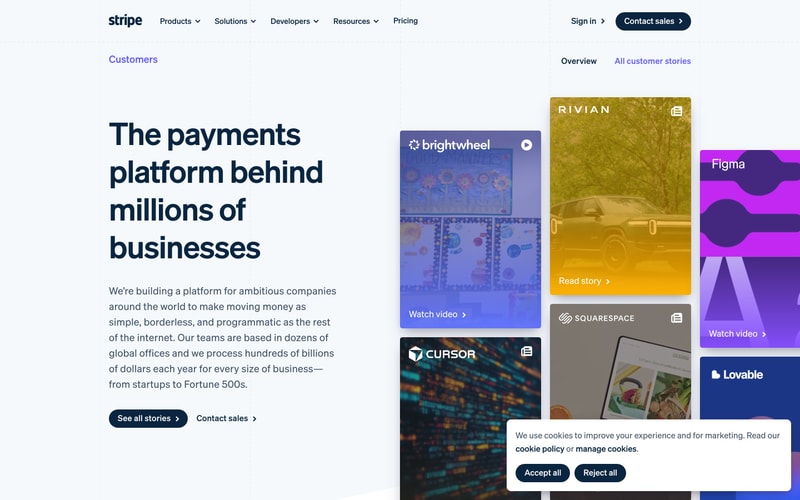
Similar styles
# Design System Reference — Stripe

Extracted from product screenshots (stripe.com)

---

## Tokens — Colors

| Token Name | Hex | Usage |
|------------|-----|-------|
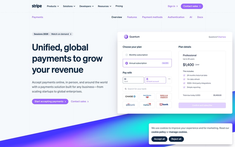
| `--color-brand-primary` | `#635BFF` | Primary brand color (Payments), buttons, links, active states |
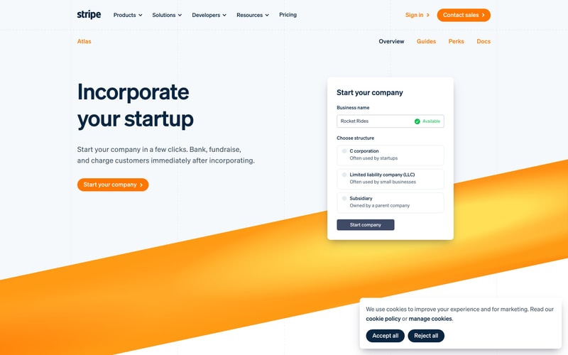
| `--color-brand-atlas` | `#FF6D42` | Atlas product brand |
| `--color-brand-hover` | `#0A2540` | Hover state for primary actions |
| `--color-text-primary` | `#0A2540` | Primary text, headings |
| `--color-text-secondary` | `#425466` | Secondary text, descriptions |
| `--color-text-tertiary` | `#697386` | Tertiary text, labels |
| `--color-text-on-brand` | `#FFFFFF` | Text on brand backgrounds |
| `--color-background-primary` | `#FFFFFF` | Main background |
| `--color-background-secondary` | `#F6F9FC` | Subtle background, cards |
| `--color-background-tertiary` | `#E3E8EE` | Dividers, borders |
| `--color-border` | `#E3E8EE` | Default borders |
| `--color-border-focus` | `#635BFF` | Focus rings |
| `--color-gradient-purple-start` | `#635BFF` | Gradient start (purple) |
| `--color-gradient-purple-end` | `#00D4FF` | Gradient end (cyan) |
| `--color-gradient-orange-start` | `#FF6D42` | Gradient start (orange) |
| `--color-gradient-orange-end` | `#FFA742` | Gradient end (light orange) |
| `--color-success` | `#00D924` | Success states |
| `--color-check` | `#FF6D42` | Checkmark icons |
| `--color-overlay` | `rgba(10, 37, 64, 0.5)` | Modal overlay |

---

## Tokens — Typography

### Font Families
- **Primary**: Custom sans-serif (appears to be "Stripe Sans" or similar system)
- **Fallback**: `-apple-system, BlinkMacSystemFont, "Segoe UI", Roboto, sans-serif`

### Type Scale

| Token | Size | Line Height | Weight | Usage |
|-------|------|-------------|--------|-------|
| `--font-size-hero` | `72px / 4.5rem` | `1.1` | `600` | Hero headings |
| `--font-size-h1` | `56px / 3.5rem` | `1.15` | `600` | H1 headings |
| `--font-size-h2` | `48px / 3rem` | `1.2` | `600` | H2 headings |
| `--font-size-h3` | `32px / 2rem` | `1.25` | `600` | H3 headings |
| `--font-size-h4` | `24px / 1.5rem` | `1.3` | `600` | H4 headings |
| `--font-size-body-lg` | `18px / 1.125rem` | `1.6` | `400` | Large body text |
| `--font-size-body` | `16px / 1rem` | `1.5` | `400` | Body text |
| `--font-size-sm` | `14px / 0.875rem` | `1.5` | `400` | Small text, labels |
| `--font-size-xs` | `12px / 0.75rem` | `1.4` | `400` | Extra small text |

### Font Weights
- `--font-weight-regular`: `400`
- `--font-weight-medium`: `500`
- `--font-weight-semibold`: `600`

---

## Tokens — Spacing

Based on 4px base unit:

| Token | Value | Usage |
|-------|-------|-------|
| `--space-1` | `4px` | Tight spacing |
| `--space-2` | `8px` | Small gaps |
| `--space-3` | `12px` | Button padding vertical |
| `--space-4` | `16px` | Default spacing |
| `--space-5` | `20px` | Medium spacing |
| `--space-6` | `24px` | Button padding horizontal |
| `--space-8` | `32px` | Large spacing |
| `--space-10` | `40px` | Card padding |
| `--space-12` | `48px` | Section padding |
| `--space-16` | `64px` | Large section spacing |
| `--space-20` | `80px` | Hero spacing |
| `--space-30` | `120px` | Extra large spacing |

---

## Tokens — Border Radius

| Token | Value | Usage |
|-------|-------|-------|
| `--radius-sm` | `6px` | Input fields, small buttons |
| `--radius-md` | `8px` | Buttons, tags |
| `--radius-lg` | `12px` | Cards |
| `--radius-xl` | `16px` | Modals, large cards |
| `--radius-full` | `9999px` | Pills, circular elements |

---

## Tokens — Shadows

| Token | Value | Usage |
|-------|-------|-------|
| `--shadow-sm` | `0 2px 4px rgba(0, 0, 0, 0.06)` | Hover states |
| `--shadow-md` | `0 4px 8px rgba(0, 0, 0, 0.08)` | Cards |
| `--shadow-lg` | `0 8px 16px rgba(0, 0, 0, 0.1)` | Elevated cards |
| `--shadow-xl` | `0 12px 24px rgba(0, 0, 0, 0.12)` | Modals, popovers |
| `--shadow-focus` | `0 0 0 3px rgba(99, 91, 255, 0.3)` | Focus rings |

---

## Tokens — Borders

| Token | Value | Usage |
|-------|-------|-------|
| `--border-width-default` | `1px` | Standard borders |
| `--border-width-thick` | `2px` | Focus states |
| `--border-style` | `solid` | Default style |

---

## Components

### Button

**Primary Button**
- Background: `#635BFF`
- Text: `#FFFFFF`
- Padding: `12px 24px`
- Border radius: `8px`
- Font size: `16px`
- Font weight: `600`
- Hover: Slightly darker background
- Includes right arrow icon (→)

**Secondary Button**
- Background: `#FFFFFF`
- Border: `1px solid #E3E8EE`
- Text: `#635BFF`
- Same padding and radius as primary

**Tertiary/Link Button**
- Text only with arrow
- Color: `#635BFF`
- No background or border

### Card

- Background: `#FFFFFF`
- Border radius: `12px`
- Padding: `40px`
- Shadow: `0 4px 8px rgba(0, 0, 0, 0.08)`
- Border: `1px solid #E3E8EE` (optional)

### Modal/Dialog

- Background: `#FFFFFF`
- Border radius: `16px`
- Max width: `640px`
- Padding: `48px`
- Shadow: `0 12px 24px rgba(0, 0, 0, 0.12)`
- Overlay: `rgba(10, 37, 64, 0.5)`
- Close button (X) in top right

### Input Field

- Background: `#FFFFFF`
- Border: `1px solid #E3E8EE`
- Border radius: `6px`
- Padding: `12px 16px`
- Font size: `16px`
- Focus: Border changes to `#635BFF`, focus ring

### Navigation

**Horizontal Tabs**
- Active: Purple underline or text color `#635BFF`
- Inactive: `#425466`
- Spacing: `24px` between items

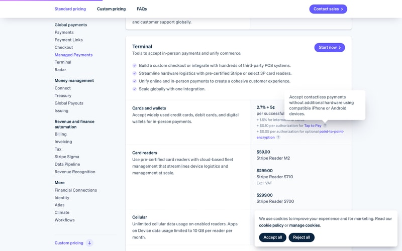
**Sidebar Navigation**
- Active/hover: Purple text `#635BFF`
- Font size: `14px`
- Section headings: `#0A2540`, font-weight 600

### Checklist

- Icon: Orange checkmark `#FF6D42` in circle
- Text: `#425466`
- Spacing: `12px` between items

### Cookie Consent

- Fixed bottom position
- White background card
- Border radius: `12px`
- Shadow: `0 8px 16px rgba(0, 0, 0, 0.1)`
- Dark buttons: Background `#0A2540`

### Gradient Backgrounds

**Purple to Cyan**
- Diagonal wave shape
- Start: `#635BFF`
- End: `#00D4FF`
- Used for Payments product

**Orange Gradient**
- Diagonal wave shape
- Start: `#FF6D42`
- End: `#FFA742`
- Used for Atlas product

---

## Layout Patterns

### Hero Section

- Two-column layout (60/40 split)
- Left: Large heading, description, CTA buttons
- Right: Feature card or form
- Background: Gradient diagonal wave
- Padding: `80px` vertical

### Card Grid

- Grid with 2-3 columns
- Gap: `24px`
- Cards with consistent padding and shadow

### Sidebar Layout

- Left sidebar: `240px` fixed width
- Main content: Flexible
- Padding: `40px` in main area

### Modal/Overlay

- Centered positioning
- Max width constraint
- Dark overlay backdrop
- Close button top right

### Form Layout

- Vertical stack
- Label above input
- Spacing: `16px` between fields
- Submit button at bottom, full width or auto

---

## Interaction Patterns

- **Hover**: Subtle shadow increase, slight color darkening
- **Focus**: Purple focus ring, border color change
- **Active**: Slight scale or shadow change
- **Disabled**: 50% opacity, cursor not-allowed
- **Loading**: Reduced opacity or spinner